What is this?
At first, UniZone started as a way to connect different departments between schools and campuses.
After diving into the problem, we realized something: this is a university wide problem! All of UR could benefit from this.
Thus, UniZone was born.
Why UniZone?
After completing user research and surveys, our results showed that students weren’t aware of the resources/events the other campuses were offering.
The only system currently in place is CCC or reading the extremely long emails U of R sends out daily (which takes serious time and effort, something students don’t have).
UniZone is a quick, convenient way to spread the word about fun student events.
Who are we?

Jordie Cohen
UX/UI
Focused on the aesthetic-appeal and visual design of the website itself (colors, fonts, typography, layout)
Kat Fuss
Marketing
Concentrated on the visual style, branding, and the social media management of UniZone.

Dato Gamsakhurdia
Technical
Worked on the functionality of the website. Implemented plugins that were necessary for Unizone concept.

Frances Inzenhofer
Technical
Focused on the construction and functionality of the site, as well as the purpose and origin of UniZone.
Who can post?
Any U of R student can post, regardless of location, major, or interests!
Simply sign in using your UR email, and you’re good to go!
What’s our goal?
Our goal is to bring U of R students together;
UniZone will connect like-minded individuals with similar interests!
How’d we get here?
SWOT analysis
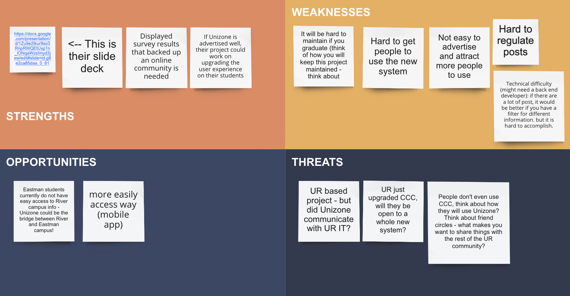
Back in Nov 2020, we used Miro to conduct a SWOT analysis on UniZone.
We wanted to see what potential opportunities and threats we could encounter in this market-space.
User flow
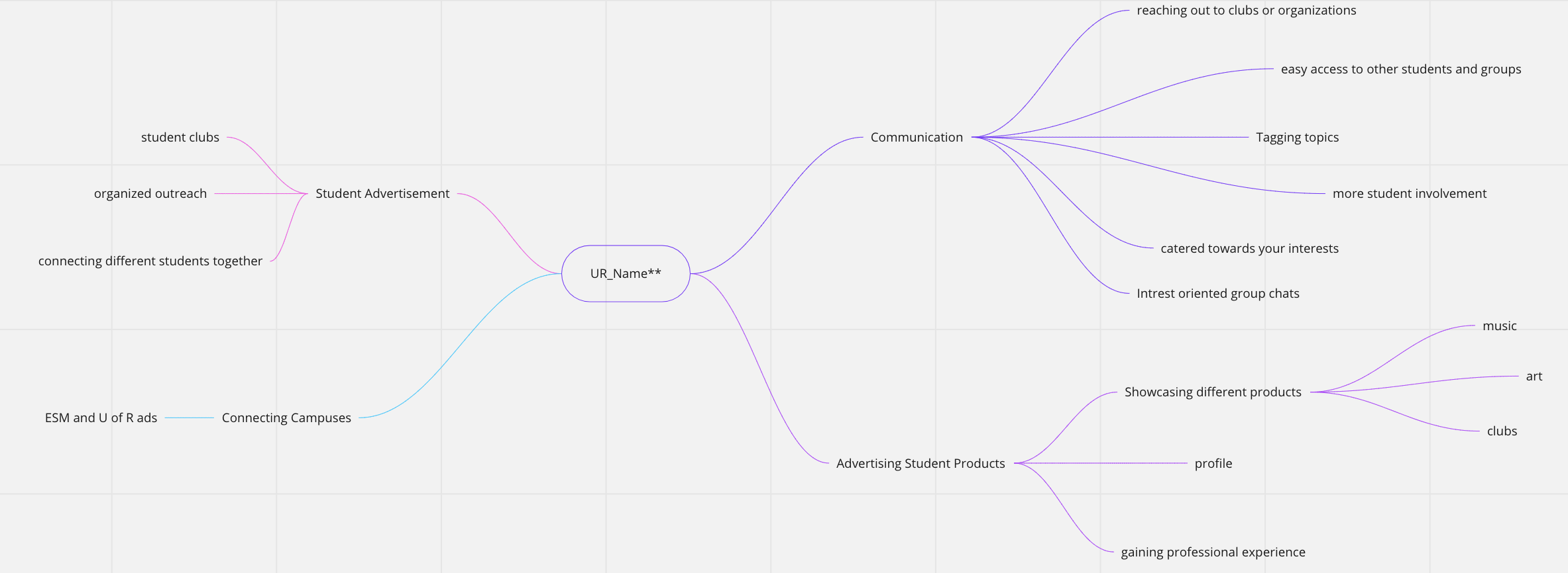
We then created an Empathy map and user flow diagram to show what uses this website would have, and who would use each one.
User persona
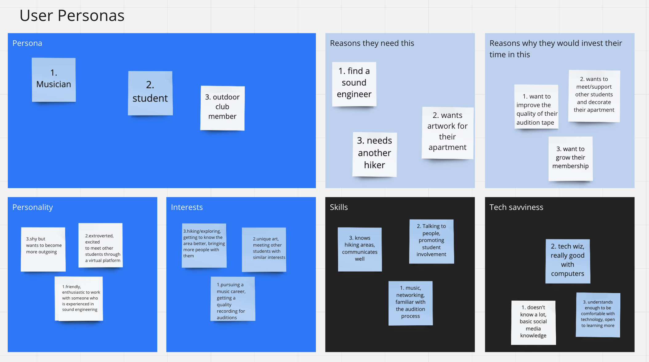
We wanted to further develop the potential users of this website… so we created user personas!
A user persona is a “semi-fictional character based on your current/or ideal customer”.
Visual brand development
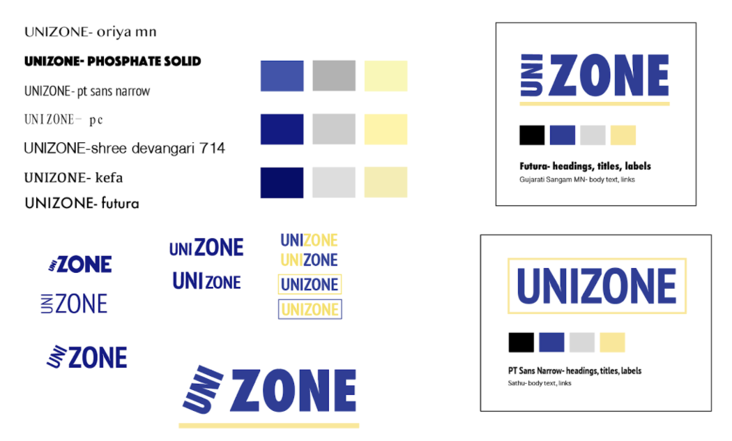
Initially, Kat developed a list of potential fonts and colors to base our website off of.
We originally planned to go with the Rochester blue and yellow color scheme for every component, but noticed a darker, higher contrast, more geometric logo would be better.
Final ‘brand’
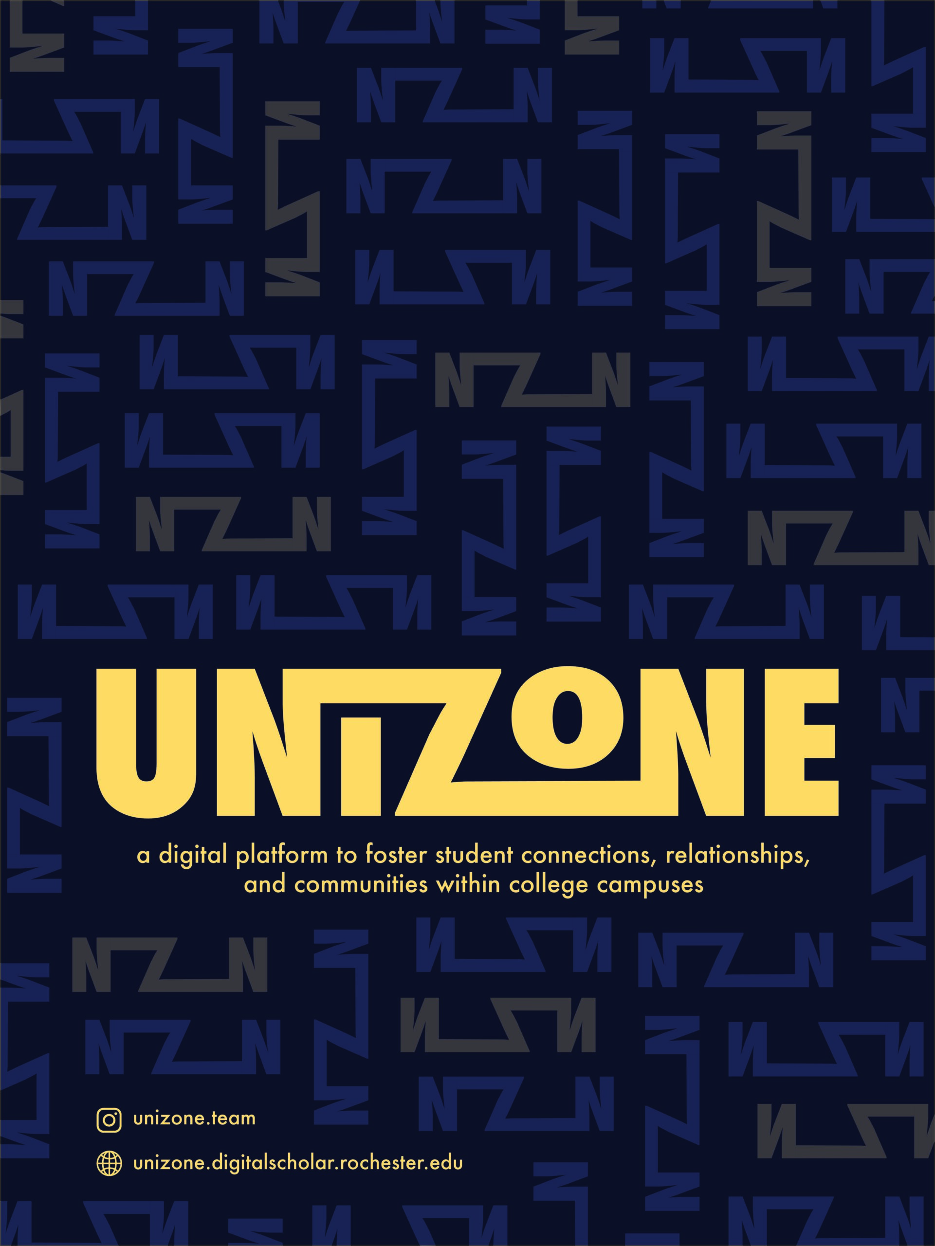
Our finalized website and ‘brand’ is based on this poster design (to the right).
The geometric play on the n’s and z (that come directly from the logo) are featured throughout our website.
Final logo design:

Social media marketing
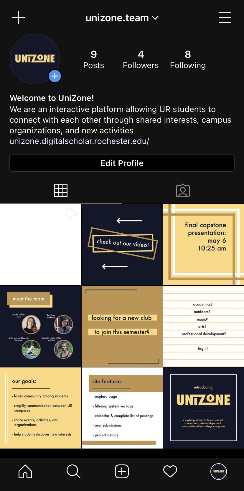
To reach our target audience of college students, we created an Instagram page as a way to share more information about our project.
With a bit of evolution in our style, we wanted to maintain the same color scheme and geometry that can be seen in our poster and website design.
Upon more traffic to the UniZone website, the Instagram story feature can be a great way to highlight new and upcoming events, so that students can keep up to date on campus involvement opportunities.
Promotional video
For our team’s final video, we wanted to create a fun array of activities that could be promoted on our website.
We rented out the Rettner video studio to film, and Jordie compiled our clips into the video shown to the right.

